Last modified: November 24, 2025
The analytics dashboard
Providers
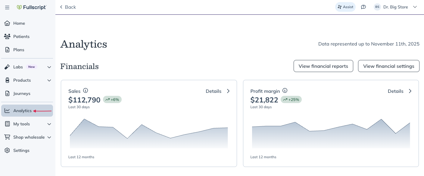
Fullscript’s analytics dashboard gives you powerful insights into your practice performance and patient behavior, helping you drive growth, optimize patient engagement, and make data-driven decisions with ease.
The dashboard
In the analytics dashboard, you’ll find different, expandable charts that show your account’s performance over the last 7 days, 30 days and 1 year. You can select any of the analytics charts to view more information by clicking the different timeframes in the upper right-hand corner of the chart.
The dashboard divides data sets into four groups. You can find analytics related to Financials, Orders, Plans, and Auto refill.
Financials
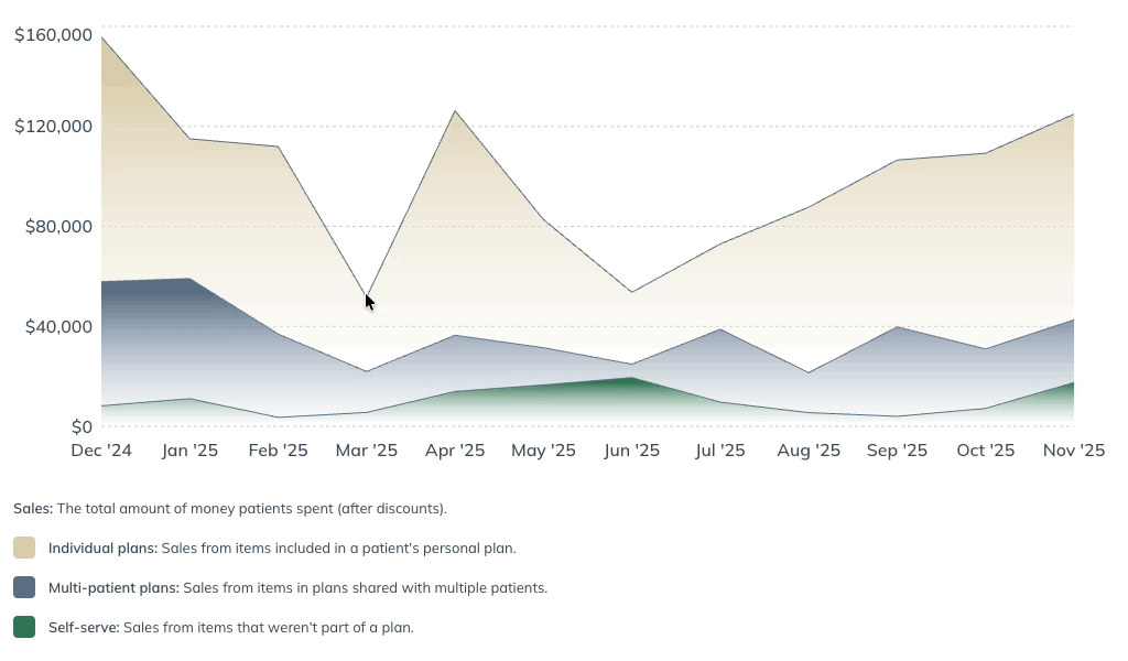
Sales
This chart shows your account’s total sales revenue – the price paid by patients for their orders after discounts, before taxes. Expand the sales graph to view monthly sales breakdowns, including revenue from individual plans, multi-patient plans, and self-serve through your store.
Profit margin
Here you’ll see your account’s earnings from individual plans, multi-patient plans, and self-serve orders. Earnings are what you receive at the end of each payout period into your bank account.
Orders
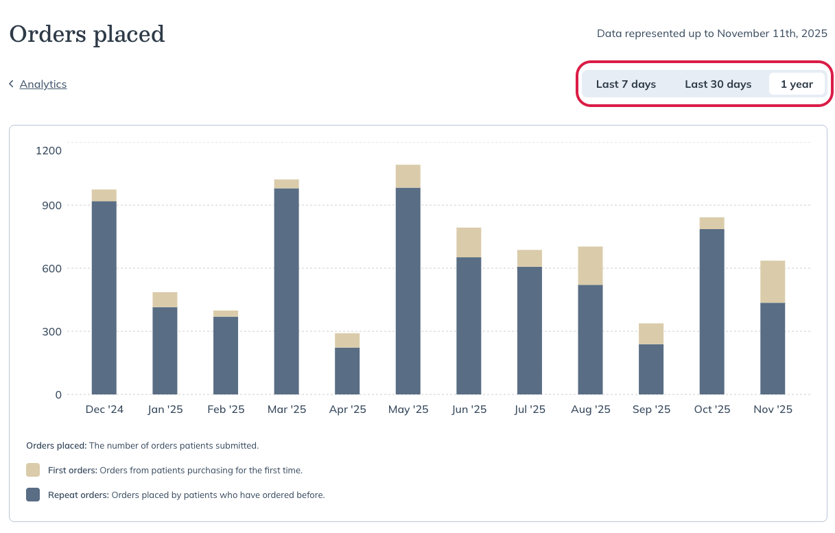
Orders placed
When expanded, this graph shows the number of orders placed by your patients over the last 7 days, 30 days and 12 months. Hover your cursor over a specific month to see a breakdown of first-time and repeat orders.
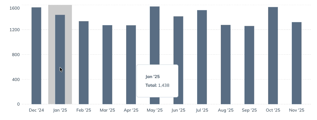
Ordering patients
This graph shows the number of individual patients who placed an order each month. The expanded graph offers breakdowns between first-time orders and repeat orders within each month.
Plans
Plans sent
This chart shows the number of new individual plans that were created and assigned to patients each month.
Plan conversion
This data shows the proportion of individual patient plans ordered within 30 days of being activated by the practitioner.
Auto refill
Auto refill sales
This chart works similarly to the Sales chart in the Financials section. In this case, it shows only revenue from orders that are part of an auto refill subscription.
First-time auto refills
This shows the number of patients that placed their first auto refill order within 7 days, 30 days and 12 months.
Auto refill orders
This chart shows the total number of auto refill orders fulfilled through your store every 7 days, 30 days and 12 months.